Saturday 29 December 2018

Alone

Alone - B&W version. Be mindful that alone and lonely are two very different things. You can be alone without being lonely, and the loneliest place I know is a crowd.

Recently, I was asked to leave a group for people with "artistic aspirations" by the moderator of the group. There were two reasons:
  • I have the habit of writing a bit about each picture. According to the moderator of the group, this is bad, because art should speak for itself.
  • My pictures lack every ounce of artistic merit.
I left the group. Why spend time arguing, when I can spend it creating pictures, or discussing art with people who do want to discuss art?

I had not planned writing about it, but today, I saw that same moderator post a video about the importance of including everyone, and never, ever shutting anyone out.

The first thing I thought was, "wow, what a hypocrite!"
My second thought was, "is she a hypocrite, or just incredibly stupid?"
The third thing that popped into my mind was, "I really hope I am not that stupid too."

Alone - Color version.
I often find myself holding the view of a minority, and quite often, the minority is just me. That can make me feel more than a little bit lonely, but it also has advantages. It makes it easier to examine, and re-examine, my views to see if I need to adjust them, or if I am outright wrong.

Quite often, when I thoroughly re-examine facts and logic, I find that I was right from the start. This is of course quite worrying, because there are many more ways to be wrong than right. If I rarely change my mind, then maybe I am not as good at absorbing new facts and re-examining my beliefs as I think I am.

I try not to judge other people's art though.

Artists work with languages of symbols. There are many such symbol languages, and I speak but a few. I cannot judge the quality of art that is created with symbols unknown to me, or that do not evoke an emotional response in me.

In the cases where I am qualified to judge why should I? I either enjoy the piece, or I do not. If I enjoy something, yes, I do tell the artist that, but if I do not, there is no reason to say so. It won't help the artist. It won't make me happier either.

Discussing art is a way of transferring knowledge about the symbol languages of art. It makes it possible to appreciate and enjoy art that one cannot otherwise appreciate and enjoy.

There are many artists I admire, and many, perhaps most, of them are very good at discussing their art. Some, like Joe McNally, William Mortensen, Scott Kelby, and Stan Lee, have written books about their way of creating art. Alex Ross makes videos. So do many others.

I believe, very strongly, that if I do not write and talk about what I do, I would severely limit my own development. Wether anyone else finds what I write and say useful...well, that is for them to say. I just do my best.

Fortunately, I have friends who are willing to share their understanding of art. I just hope my ideas have enough merit, so I can give my friends something in return for all the ideas and insights they have given me over the years.

So, while I do withdraw from others quite often, in order to think and work, and thus is often alone, thanks to friends and family, I am rarely lonely, despite my tendency to be a misfit in social media groups.

Sunday 16 December 2018

Kyla Rising - Contrast and composition


I often look at pictures made by the artists I admire, like Joe Jusko, Gerald Brom, Frank Frazetta, William Mortensen, and Michael Whelan, to better understand what it is that makes their work outstanding.

One of the things is contrast! Look at the work of the artists I listed. Black & White pictures are nearly always high contrast, with the main subject clearly differentiated from everything else in the picture. It is the same thing with the color pictures. If you turn on of their color pictures Black & White, you will see the same thing: Clear separation of subjects and background. The main subject clearly separated from everything else.

There are exceptions, but those are deliberate exceptions, when blending different parts together is the point. It rarely happens by accident.

Me, I am struggling, and, I hope, slowly learning to do the same thing.


The picture above is a visual analysis of the picture, similar to the one I made for Arachnophobia II. Even though I have used many elements borrowed from Mortensen's visual language, and some from other sources, the primary element is contrast: Light and darkness, sex and fear, water (soft), and stone (hard).

Below are  four different versions of Kyla Rising, two in colour, and two B&W. Have a look at them.Which is your favorite version? Why?


That is all for now. I'll get back to preparing picture ideas and photo sessions for 2019.

Be seeing you!

Sunday 28 October 2018

Wolf Moon - Where are all the Female Werewolves?

Wolf Moon
A long time ago, when I was way to young to watch horror movies, I used to watch them anyway, with my grandfather. I was completely mesmerized by Lon Chaney Jr. in The Wolf Man, the 1941 original of course, not the 2010 remake.

Over the years, I have seen my fair share of werewolf movies, good and not so good: An American Werewolf in London (1981), The Howling (1981), The Company of Wolves (1984), Teen Wolf (), Wolf (Jack Nicholson, 1994), Dog soldiers (2002), and a couple of others.

Two observations:
  • Werewolves were more popular in the 80's than they are now. Yes, there are modern werewold movies, like the Wolfman (2010) remake of the original Lon Chaney, Jr. movie, but they are nowhere near as popular as they used to be.
  • There is a distinct lack of female werewolves, both in old and newer movies. There are exceptions like Ginger Snaps (2000, and supposed to be good, I haven't seen it), but overall, werewolves tend to be male.
 It struck me that if I want to do werewolf pictures, redressing the gender imbalance would be a good thing.
Wolf Moon - High Contrast B&W
So far, I am just experimenting with a werewolf 3D model, dramatic lighting setups, and postprocessing styles.

The next step is to create a storyboard, or two, and to try to get models interested.

Would you be interested in facing a werewolf a moon-lit night?

Storyboarding - the key to better collaboration between model and photographer

Cat and Mouse
For the past couple of years I have been storyboarding my photo sessions, usually with simple, and rather ugly, pencil sketches.

Some time ago, I decided to step up the quality of the storyboards a bit. There are two reasons for this:
  • I can set up and test the 3D parts of my pictures before the photo session. That makes it easier for me to see whether a picture will look as good on screen, or printed, as it looks inside my head. If it does not, I can scrap the picture before I do a shoot with a model. That saves both the model and me a lot of time and effort.
  • When I discuss a shoot with a model, I can show something that is fairly close to what the final picture will look like. That way, it is easier for a model to decide whether she/he is interested or not. It is also easier to discuss how to set up the shoot, what props will be needed, and what the model will have to do to prepare for the shoot. This also saves time overall, and improves the final result.
What I do now, is that I shoot my backgrounds first, then render and composit 3D elements, and use a 3D model as a stand-in for human models. After compositing, I also do the final painting process.

This gets me as close as I can to a final result without doing the actual photo session with a live model.
Cat People
Cat People is a good example. A model can see  what the final result will look like, the position she will sit in, and the overall mood of the picture. Of course, if the model I work with have suggestions for variations and improvements, I am happy to discuss them, and try them out.

I use the picture to figure out how to light the model during the photo shoot, camera angles, whether to change anything in the 3D render, possible variations... There is a lot of stuff that can change from when I created this storyboard to the final picture. What the storyboard provides, is a great starting point.


Taking the Jaguar out for a Spin

Rite of Passage

That's it, for now. Next time, a few words about werewolves.

Sunday 23 September 2018

Kyla: A Gift for the Queen

A Gift for the Queen
Much as I like the Fantasy art of the 80's, there are some things that disturb me. For example, the frequently recurring theme of subjugation of women by implied or overt force. While Fantasy art may have improved a bit, I do have some doubts whether society at large has become more gender balanced, or if the gender biases and prejudices are merely better hidden.

One way to bring gender issues to the fore, is to flip the roles around, so I did.

If you want to see a couple of variants of this picture, check them out at ArtStation.

End of Days: A Visitor from R´lyeh

It's been awhile since I worked on a picture. The reason is that I got a new job, and I went into deep immersion mode to get up to speed as quickly as possible.

I really like the job, and I think it has affected my ability to make pictures. It's not just that I lack time. I am much to happy to make dark, brooding, or horrific stuff.

I tried to make the picture above a nighttime picture with the monster partially visible in a cone of light from the helicopter.

It didn't work. Finally, I gave up and made a bright and cheerful. watercolor style, picture instead.


Of course, once I have the base image, I can paint it in many different styles, so I can make a dark, ink-like painting if I want to, like the one above. Perhaps it does suit the Lovecraftian theme a bit better.

Oh, well, back to work...my new job, that is.

Sunday 12 August 2018

Postcards from Halmstad


I have been in Halmstad twice recently, once for a birthday party, the other time to visit my mother.

Whenever I visit, I like to take long walks with my camera. The environment is quite different from Gothenburg, so I can get pictures there, that are a bit different from what I shoot in Gothenburg.

I haven't started a Halmstad Nudes series though. I have thought about it, but I want to finish the Öland Nudes series first, and as I mentionen in my previous blog post, I will have limited time to make pictures in at least the near future.

So, without further ado, here are a few pictures from Halmstad. I hope they give you at least a little bit of a feel for the city where I grew up.


Talking a walk in the Halmstad harbor is fun, and occasionally rewarding. I rather like this shot of an old crane. The composition is clean, the colors vibrant, and it looks like what it is, a fine summer day.

Many years ago, I was a member of the Halmstad canoe club. There was a rowing club right across on the opposite side of Nissan, the river that runs through the city.

I do not know if this guy is from the rowing club, but he just might be.


There are some old streets in Halmstad. This one, Hantverkargatan, looks like something Paul Cezanne would paint, so I processed the photo in a Cezanne-ish style. Turned out better than I expected.

There is a bridge near the Halmstad City Library, where young lovers like to leave padlocks as a symbol of their eternal love.

There is a Swedish saying that "old love never rusts". Given the somewhat tarnished appearance of most of the padlocks, I found that quite funny.

I do hope the love lasts longer than the padlocks.

One day I went to the Gunilla Park to have lunch, sandwiches, on a bench near the Gunilla Fountain.

Talk about a work of art rife with symbolism...


The statue is from the late 40´s. There is some debate over who created it. Various sources claim it was Axel Emil Lindskog, J.E. Lindeskog, or maybe K.B. Bjering.

I got a few shots more while I was in Halmstad, but I'll leave those for another time.


Be seeing you!

Öland Nudes III: Eve

Öland isn't the Garden of Eden, but it is a beautiful island. The landscape is to a large extent open grassland. Here and there you will find small forests of windblown trees.

Eve started out as a jungle theme picture, but I changed my mind early on. I wanted to connect the picture to one of my ongoing series, so it was either adding spiders and turn it into an Arachnophobia picture, or change the setting to Öland, and make it a part of the Öland Nudes series. I chose the latter.

Sometimes I wonder if you have to be lonely to do any kind of artistic work. I wrote my first book in 2008-2010, during a period when I felt very lonely.

Since then, I have found that I am more productive during periods of loneliness and sadness. When life takes a turn for the better, the urge to create does not disappear, but it is muted. Perhaps because I feel I may have a future, may not just survive, but live and be happy, after all.

I started a new job a week ago, and I feel pretty good about it. I'll be busy working, something I really look forward to.

That leaves less time for photography, and all the weird stuff I do to create my pictures. I probably won't have time to write another book either, at least not for some time.

The one project I want to return to and focus on this year, is Alice: Demon's Gate. We'll see if I can manage a full time job, and work on a graphic novel at the same time.

Friday 10 August 2018

Gothenburg Nudes XII: Naked Juice Bar

The 12th, and probably final picture in the Gothenburg Nudes series. I started the project because I was a bit tired of seeing pictures that objectify women. I wanted to create a series of nude pictures where nude human bodies are just appreciated for what they are: beautiful.

I have done that to the best of my admittedly meager abilities. It is time to move on to something else, unless, of course, I come up with an interesting idea.


Tuesday 31 July 2018

Arachnophobia III: You are like an evil Bob Dylan!

I have gotten a some interesting comments on my recent pictures. I thought it might be fun to share them.

Here are comments on Arachnophobia III:
"You are like an evil Bob Dylan!"
- Tim Mårtensson, my son, and my harshest and most brutally honest critic.
"Dude! I don't have a clue what kind of childhood experiences you had with spiders, but your series is awesome!"
- Luis Carriere
 " I'm torn here. These pieces of yours are genuinely unsettling and well-crafted, so I'm happy that great art is being added to the world. On the other hand, SPIDERSPIDERSSPIDERS UGH OH GOD THEY'RE IN MY HAIR THEY'RE IN MY HAIIIIIR"
-Joel Clark
 Arachnophobia II also got comments. Here are a few of them:

"The sky didn't need so much texture but apart from that, stunning work."
-Barry Manowar
By the way, Barry is right. The sky should have less texture, because the texture distracts a bit from the point-of-interest, the battle with the giant spider. The reason that I haven't fixed it is that I generally prefer to leave a trail of imperfections, and instead try to do better on the next picture. I'll try to remember Barry's point the next time I create a picture with blue skye in it.

"Reminds me of the art from early AD&D."
-Michael Summers
"Like it, has a very vintage sci-fi novel cover feel. Awesome!"
-Corey Fuchs
 When I re-read these comments, I realized that what I wrote yesterday about not being sentimental, and not creating sentimental pictures, is wrong. I am very sentimental.

It's just that while many other people get sentimental about sunsets, I get sentimental about my friends in my old gaming group, my friends in my old software development team, I get sentimental about the debates we had about Science-Fiction, Fantasy, Horror, and science.

Here is a comment about Arachnophobia I:

"Hahha nice Really fun and exciting image."
-Jonas Henriksson

When I did the analysis of Arachnophobia II, I wrote about how I used guidelines from a 1937 book on photography to create pictures with a broad appeal. So far it seems to be working.

I'll return with more arachnophobic pictures soon. You can stay tuned by following my Facebook page, by following me on Google Plus, or by following me on ArtStation.

Monday 30 July 2018

Arachnophobia II: Pictorialist design breakdown


I recently re-read The Command to Look, a brilliant book on photography by William Mortensen. The book was published in 1937. It is well written, Mortensen had a wry sense of humour, he understood people much better than I ever will, and as for the photography...he was well ahead of his time. If he had written the book today, he'd still be ahead of his time.

When I read something I am really interested in, I often make a breakdown of the major points, and how they relate to each other. Sometimes I create a mindmap, at other times, I scribble notes on a large sheet of paper.

With The Command to Look, I took the scribbling-on-large-sheet-of-paper route.


Early in his career, Mortensen photographed movie stars in Hollywood. The only trouble was, he wasn't happy with his own photos.

Mortensen set out to discover how to take a really good photo. After a lot of hard work, and going down a number of blind alleys, he constructed a simple formula for how to make a memorable photo:

  1. The picture must make you look!
  2. Having looked - See!
  3. Having seen - Enjoy!

Fortunately, he elaborated quite a bit on that, and that is what The Command to Look is all about.

In Arachnophobia II, I have used several of Mortensen's ideas about how to construct a picture.

To make people look, I use a large, dominating mass. Mortensen's idea was that a large mass draws attention, because it is instinctively perceived as a threat. The large mass does not have to be threathening, it just has to trigger the instinctive response.

Getting people to look is not enough. Once people look, there has to be something there to see. Mortensen defined three broad categories of pictures that are of interest to most people:

  1. Sex
  2. Sentiment
  3. Wonder
Sex is any picture that has a sexual component. A seductive smile falls into this category. So does porn, and a lot of things in-between.

Have a look at ArtStation, and you will see a lot of contemporary art with a strong sexual component, without having actual sex in them. For a classic painting, do look at the beautiful Le Sommeil by Gustave Courbet.


Sentiment is probably the most popular category. All the cat, dog, and sunset pictures you see on Facebook have a strong sentimental component, at least in the mind of the photographer.

Personally, I do not like overly sentimental pictures. They tend to be bland and boring. The biggest problem is not with any single picture. The biggest problem is that there are so many of them, and that they are nearly all boring.

I have never understood why it is a great thing to be bored out of your skull, but apparently, I belong to a rather small minority.

Wonder is where imagination and creativity lives. Pictures that  show you things, creatures, people, and worlds that exist only in the imagination. Here you will find pictures of John Carter battling four-armed giant apes on Mars, H.R. Giger's Alien, majestic starships by Chris Foss. The limit is only the limit of imagination.

The Arachnophobia series of pictures belong squarely in the Wonder category. Unless, of course, you live in Australia. (Don't look if you really have arachnophobia.)

So, it is my hope that a picture of two medieval warriors fighting a giant spider will be strange enough to create a sense of wonder in you when you look at it.

The third part of Mortensen's recipe is enjoyment. He was rather specific about what that meant: Create a path for the eye to follow, guiding the viewer from discovery, to discovery, with the occasional obstacle to keep things interesting.

This is definitely something I need to work more on, and I will, in pictures to come.

If you haven't seen Arachnophobia I, click on the link to check it out.

Saturday 28 July 2018

Arachnophobia I


I am starting off a new mini-series of pictures, Arachnophobia. I sat down to make a picture involving a T-Rex, but the ideas kind of morphed while I was working.

Spiders are fascinating. Looking at a spider is looking at a completely different form of life. It might as well be from another planet.

Giant arachnids have been popular in monster movies since Tarantula (1955). One of my favorites is Eight-Legged Freaks (2002). Tolkien created Shelob, and Peter Jackson put it on the silver screen in The Return of the King. Another fairly recent giant spider is Aragog, in Harry Potter and the Chamber of Secrets.

Obviously, giant spiders are a lot of fun, unless they eat you, of course.

The setting for Arachnophobia I is Primus Vicus, a medieval village not far from Halmstad in Sweden. I'll vary the environments quite a bit in the series, but I plan to stick with the medieval Fantasy theme I began with.


Here is the photo composite I constructed to have a base for the digital painting process.

As the series progresses, I will test and use various ideas from the early 20th century pictorialist William Mortensen. Specifically, from his book The Command to Look (1937). More about that next time.

Friday 20 July 2018

Pictorialism vs. Neo-Pictorialism vs. Contemporary Pictorialism

Bareback Riders - Pictorialist Version
In this article I will use the same basic photo to create three very different pictures, a pictorialist version, a neo-pictorialist version, and, for want of a better term, a contemporary pictorialist version.

Hang on! You are in for a ride!

The slow bit: A brief history of pictorialism

 Pictorialism is a photographic style that was popular from 1885 to about 1920. The style all but disappeared for a long time, but it was rediscovered in the 90's.

The rising interest in the original pictorialists and their pictures, also kindled an interest in recreating their style. Behold, neo-pictorialism was born!

Neo-pictorialist pictures are stylistically very similar to pictorialist pictures, but there are important differences. If there weren't, this article would end here.

What about contemporary pictorialism? First of all, I invented the term. There are people today, who do what the pictorialists did a hundred years ago. Because there is a 100 year gulf separating the original pictorialists from the contemporary ones, the technology has changed, our society, and social norms, have changed. Therefore, a contemporary pictorialist picture can look very different from a pictorialist picture from 1918.

Enough with the history lession! Let's get on with creating the pictures!

The boring base photograph

Base Photo: Bushes and Borgholm Castle
The base photograph is a picture of some boring shrubs. You can see the Borgholm Castle in the background, but as castle photos go, this one is pretty much a dud. The castle is very interesting, but you cannot see that in this picture.

Let's take this unremarkable photo, and have some fun with it!

Neo-pictorialist version

Bareback Riders: Neo-Pictorialist Version. Note the absence of horses and riders.
Let's begin by giving the picture the neo-pictorialist treatment. When people talk about creating pictorialist pictures today, they usually mean neo-pictorialist pictures.

Neo-pictorialism is mostly a technical exercise. The objective is to make a picture stylistically similar to an old pictorialist picture. The closer you get, the more you have succeeded.

Pictorialists in the early 20th century wanted to evoke emotion. They wanted to create art. To do that, they turned to painters for inspiration. Consequently, they often wanted their pictures to look like paintings.

To create painterly effects, the pictorialists used a great variety of tricks. Anything that worked was okay to use. They often blurred their pictures, they hand-colored them, dodged, burned, used early composition techniques...

Neo-pictorialists recreate the look of the pictorialist photos, much like historical reenactment societies recreate old battles.

Thus, if we take our base photo, and make it look stylistically like a pictorialist photo, then we have a neo-pictorialist photo.

Why are there no horse and riders in our neo-pictorialist version of the photo? Because there is no reason to have them there. Only the style is important. The content does not matter, as long as it does not look too modern. Consequently, neo-pictorialist pictures are often pictures of nature, landscapes, forests. A really old car is okay to shoot, but a modern car is not. To some neo-pictorialists, shooting with old lenses and using the original processes is a matter of pride.

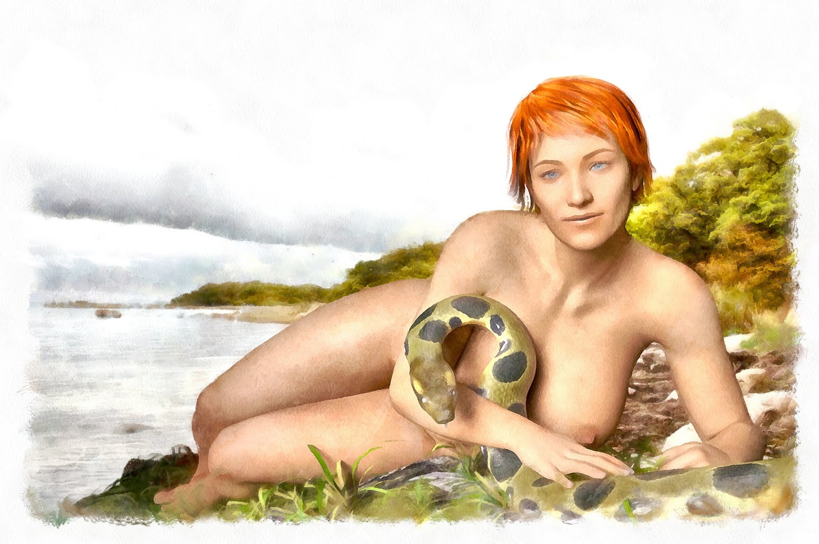
Pictorialist version

Bareback Riders: Pictorialist Version
In the pictorialist (1920) version of the photo, the style is exactly the same as in the neo-pictorialist version, but the content is different. Why?

Because, to a pictorialist, content was important. Pictorialists asked questions like:

Is it beautiful?
Is it scary?
Does it tell a story?
Does it convey an idea?
...and so on

A pictorialist uses whatever means available to further the purpose of the picture. It is that simple.

They did not care about using the "correct" process, or whether the picture conformed to genre conventions. They used whatever means they had. The style is as much a result of technical limitations, as of aesthetic considerations.

For this picture, I have stuck with the convention of making the photo look like a painting, but the technique I use for doing so is completely modern. In case you are curious, I used Dynamic Auto-Painter, a tool that analyses the photo, and with a little guidance from me, recreates it from scratch, as a painting.

Making their pictures look like paintings was a means to an end, not an end in itself. It was a convenient way to help viewers relate to the photos by relating the photos to something the audience already knew. (A bit like when the iPhone was introduced. The iPhone is a miniature mobile multi-purpose device. Most of the time it is used, it is used as something other than a phone. Calling it a phone made it easier for people to relate to it.)

Nudes are common in pictorialism because the nude human form evokes feelings. Most pictures are of nude women, because most of the photographers were male. There are exceptions though. There were female photographers, and photos of nude males.

Note the difference between pictorialist and neo-pictorialist:
  • The pictorialist uses cutting edge technology and processes to express emotion and ideas.
  • The neo-pictorialist tries to emulate the results of processes used by pictorialists in the period 1885-1920.
What would a pictorialists do today? I am glad you asked.

Contemporary Pictorialism

Bareback Riders: Contemporary Pictorialism
A contemporary pictorialist would ask the same, or similar, questions that a pictorialist would:

Is it beautiful?
Is it scary?
Does it tell a story?
Does it convey an idea?
Do I have to ask exactly the same questions a pictorialist would have asked 100 years ago? (Hint: The answer is NO!)


If you have read my blog posts about the Gothenburg Nudes series, you know that the basic idea was to separate nudity and objectification, for the purpose of making room for appreciation.

This basic idea guided the design of each picture, and of the series as a whole. The Öland Nudes series uses the same basic idea, but it is tailored for a slightly different audience.

People tend to relate to places they know, so I use familiar locations to trigger interest, before I hit t
hem with abstract concepts.

I admit, it does not work perfectly. Some people see nipples, and after that, they see nothing else. This happens both with those who like nipples, and those who don't. Neither group is my target audience.

My target audience is the group of people who appreciates both the beauty of the human form, and abstract reasoning...and especially those who either live in Gothenburg or on Öland.

If you live elsewhere, please do not feel left out. You can appreciate Gothenburg and Öland even if you do not live there.

That is the difference between pictorialism, neo-pictorialism, and contemporary pictorialism as I see it. Feel free to disagree. If you do, please also feel free to comment. I am interested in your opinion, whether your argument changes my mind or not.

Öland Nudes II: Bareback Riders

This picture has been stuck in development since 2016, so, yay! Done!

As I continue to work on my nude pictures, I add variation in body types, skin tones, and other factors. This is intentional. I want a lot of variation.

At the same time, I am held back by my fear of botching it completely. I understand that my never-quite-sufficient skills dooms me to produce pictures that are a pale reflection of reality.

I keep trying, because that is the only way to suck less at it.

While I worked on this picture, the discussion in Photo Meetup in Gothenburg turned to pictorialism again. Sara Liljegren mentioned photographers like Don Hong-Oai and Barbara Cole. (Do click on the links. Both are very interesting photographers.)

The discussion got me thinking about the relationships between pictorialism, neo-pictorialism, and contemporary pictorialism. (I made the term "contemporary pictorialism" up, to describe what Barbara Cole is doing, and I try to do. Nevertheless, these are three distinctly different approaches to creating pictures.)

So, using the picture above as an example, I set about creating three different versions of it, based on the three different branches of pictorialism.

I'll blog about that next time.

Thursday 19 July 2018

Öland Nudes I: At the Beach

I needed a change of pace from the Gothenburg Nudes series of pictures, so I cunningly switched to a series of nudes from Öland.

Seriously, a few of my friends, Petra Brewitz, Julia Reinhart, Petri Olderhvit, and held exhibitions in Borgholm, in 2016, and 2017, at the Öland Harvest Festival.

Petra and I were discussing our trips the other day, in-between coffee breaks (Sw. fika.). Swedes normally work, and break for coffee. Petra and I have coffee and break for work, so we talk in-between the breaks, instead of during the breaks. Somewhat surprisingly, the system works, and we are more productive than you think. Even when we do not produce anything, we still get coffee, so, upsides only.
Julia Reinhart, Petra Brewitz, and Petri Olderhvit, looking like the photographers they are. I tend to look like the photographer I am, which is why I am not in the picture.
When we visit Öland, we make sure to have time to go on photo walks, and the occasional trip by car, to get some cool photos. The landscape is fantastic. Öland is a rather flat island, with the occasional windmill, or iron age fortress, sparsely and randomly distributed through the landscape. Well, not really randomly, but it feels that way when you are on foot.


While Petra and I were talking, it struck me that I just might have enough pictures from Öland to start doing something with them, like a series of pictures.

Because I am still in nude mode (that sounded better in my head than it reads from the screen), I am eschewing the vikings and monsters for a while, and create a few Öland Nudes in parallell with the Gothenburg Nudes series.

We'll see how it goes.

Sunday 15 July 2018

Author Portrait: Fred Brooks

Fred Brooks
I had the great honor to photograph Fred Brooks recently. Fred Brooks is the author of The Mythical Man-Month, one of the most famous project management books of all time. The book inspired what later became the agile movement in software development.

In addition to writing several very influential books, Fred Brooks is one of the great computing pioneers. He worked at IBM, on developing the IBM 360 series, and it was his idea to switch from using 6 bit to 8 bit bytes. This change made it possible to support lowercase characters, something computers had not done before.

Brooks founded the computer science department at  University of North Carolina at Chapel Hill, where he is still active.

I read The Mythical Man-Month many years ago. I was interested in agile software development, and Fred Brooks was a favorite author of my favorite authors of books about agile. Meeting Fred Brooks was great, even though the meeting was very brief.

The photo shoot was a panicky thing. As sometimes happens, I had set everything up for the shoot in one location, and then had to shoot very quickly, in a completely different location, that was unsuitable for photography, to say the least.

This happens from time to time. When it does, you simply do your best.

Tuesday 10 July 2018

Gothenburg Nudes XI: Reflections at the Pond

 Reflections at the Pond is the eleventh picture in the Gothenburg Nudes series.

I had planned a visit to the Gothenburg Botanical Garden to find a suitable environment for one of the pictures.

Two of my friends in Photo Meetup in Gothenburg, Kristina Johansson and Sina Farhat arranged a Short Depth-Of-Field themed meetup in the Botanical Garden. That was perfect for me. It was an opportunity to dust off my macro lens, which was long overdue. Even better, it was an opportunity to meet a few of my friends.

I do meet my friends more often than I bring out the macro. Still, meeting them was long overdue too.

And, I got to photograph two birds with a single click. (Killing them with a single stone sounds too harsh.) After practicing shooting with short Depth-Of-Field, we went exploring for a bit. I got separated from the others, stumbled on to a pond where the water was a still, perfect mirror, and...voila! I had exactly the environment I was looking for.

After shooting the pond, I discovered I was actually just a few meters from the rest of the gang. I joined them, and we left the garden together.

If you want to see how I created the picture, check out the project at ArtStation.

Sunday 1 July 2018

Gothenburg Nudes X: The Real Secret

What is the real secret? It depends on how you interpret this picture.

I am sure you have heard that there is no right or wrong way to interpret a work of art. That may be, but to create a piece of art, is to create with purpose.

If the artist manages to convey that purpose, there is communication. If the purpose cannot be discerned by the viewer, the viewer may still like, or dislike, the work, but as a means of communicating ideas, the thing is a bust.

Just for fun, have a look at The Real Secret. What do you see? What does it mean?

Write it down, just so you remember clearly what you saw, before I explained my intent when I created the picture.

Are you done?

Good! Here we go!

The Gothenburg Nudes series as a whole, is about separating nudity from objectification. In order to do this, I create pictures where the women have a purpose of their own. They are doing their own thing. They do not pose for an observer. This idea holds for The Real Secret too.

Note how the woman walks past the store without even looking at the lingerie. That is intentional. You have to accept her on her own terms, without adornments. She is not dependent of anyone else's approval.

She is walking nude in a city, so she either ignores or flaunts conventions. However, she just walks at a brisk pace, she seems intent on going somewhere. She is not showing off. So, no flaunting, which means she does not care much about conventions. Well, at least not nudity conventions, but they are themselves a symbol for other conventions and opinions that are based on habit, not thought.

Did you notice the dab of orange in her left armpit? That is hair. She does not shave her armpits, and that is another convention that she ignores.

I personally find her interesting because the way she thinks is way outside the box. The nudity is merely a symbol for the ability to think outside given parameters.

Have you looked at the man looking into the store? He checks out lingerie, none of it having a woman in it, but he completely misses the interesting woman outside the store, that is, outside the box.

So, he represents people oblivious to beauty outside the norm. He is trapped by the conventions and expectations he is used to.

So, what is the real secret?

What is it that makes her interesting, and worthy of appreciation?

It is obviously not lingerie, or willingness to please anyone else's expectations.

It is her ability to think outside the box, and the confidence and courage that allows her to follow through with it. That is her secret, and it is in plain sight, if one really looks.

So, what was your interpretation? Feel free to comment.

Oh, one more thing! Most of the women in the picture series are redheads. Why? Try to figure it out. The answer may surprise you. I'll write about it in another blog post. Maybe the next one. Maybe not.

I have put a breakdown of the picture into its elements on ArtStation.

Friday 29 June 2018

Artistic Dilemma: To Pose or Not to Pose

A posed shot from 2013. Note the triangular composition. Models: Emma and Ida Stranne

When I started with photography I tried to learn as much as I could from other photographers. I read photography books by the masters, I took every opportunity I could to make friends with other photographers.

It worked! I did build basic skills. Because I built the same skill set that everyone else has, my pictures looked much the same as everyone elses.

This has advantages. My pictures were more popular back then than they are now. It was easier to discuss photography, because I had the same frame of reference as the photographers I met.

Superheroes Against Cancer, 2013
If my photos had a distinguishing feature, it was the subject matter more than the style.


As I learned more, I began experimenting with light, the way many photographers do. Here too, I ended up with the usual techniques for creating High Key and Low Key photos, and wide range in between the extremes.

As my skills grew, I wanted to incorporate my other interests into my photography.

For example, I am interested in Science-Fiction, and I read a lot of comics when I was younger, so the next logical step was...
From the graphic novel A Rift in Time

...to create one with some of my friends. There were eight of us, and we had a blast. It took more than 15 months, but we actually did get A Rift in Time published.

There is one crucial thing comic book artists do differently from photographers and painters: Posing!

Comic book characters are usually shown in real life poses, like when they are walking, and talking. In many comics there is also a lot of fighting. Thus, comic book artists are great at showing motion.

They tend to have a greater range of compositional tools at their disposal than photographers, but in my view, the real gamechanger is the idea that you can capture motion in a still frame. Closely related to that, is the idea that characters should look and behave naturally, instead of posing for an observer.

Elinor and the T-Rex, 2017 Model: Noor Model Noor
Don't get me wrong, there is nothing wrong with traditional model poses. It is just that there should be room for more than that.

If all model photos use a small range of poses, compositions, etc, then they will become boring. Each new photo will contribute to making both itself, and the photos taken before it, less interesting.

Add a little inspiration from a genre outside traditional photography, and suddenly you can make something fresh and different again.

Elinor and the T-Rex, with the model Noor Model Noor, was inspired by Fantasy and Science-Fiction Artist Joe Jusko's painting Inferno. (Take a look! It is worth it. Joe Jusko is a great artist.)

You may notice the presence of compositional devices, like leading lines, but there is nothing resembling a traditional model pose in the picture.


Jungle Moon, December 2017

When I got interested in creating Fine Art Nudes, at first, it was back to posing again. The reason was that I consciously imitated some of my favorite artists.

Jungle Moon above was based on one of my favorite paintings by Frank Frazetta. My lack of originality is intentional. When I start learning something new, I imitate. Adding something of my own comes later.

The Pit, December 2017
Creating the pictures I wanted to do photographically would have been very expensive, so I turned to a combination of 3D and digital painting. Well, digital smearing is more like it...I build pictures like a photographer would, because I can't draw or paint.

Dangerous Shadow, March 2018
I gradually refined my workflow, and incorporated ideas from fantasy art, and comics.

I also created a recurring character, Kyla. Her first appearance was in Dangerous Shadow, in March 2018. Kyla's appearance was based on Fantasy, especially the Cavewoman sub-genre of the Lost World genre. She owes a lot to Frank Frazetta, Boris Vallejo, Budd Root, and similar artists.

However, I did change one thing, her behavior. Kyla is no damsel in distress. She rescues herself from whatever predicament she runs into, and she does it in an efficient manner, without overt posing, sexy or otherwise.

Aftermath/Blood on Her Hands, March 2018
Yep, i went to extremes in order to make a point.

I will almost certainly return to making more pictures with Kyla, but after the first half-dozen or so, I wanted to do something a bit brighter, softer, and easier to relate to for those unfortunate souls who haven't read tons of Fantasy and Science-Fiction books.

The Moon Maiden, May 2018

Back to the drawing board again. I like Gerald Brom's painting Moonlight very much, so I used it as inspiration for my own The Moon Maiden.

You may notice that while the Moon Maiden is action-free, it is back to posing again.

Gothenburg Nudes VII: Bathing Women
After fiddling around a bit with various ideas, I decided to do a series of nudes where women do their own thing, without posing, or even acknowledging, that there is an observer.

The idea was to separate nudity from objectification and sexualization, in the hope it would pave the way for appreciation.

That is pretty much where I am now. I have made nine pictures in the Gothenburg Nudes series. I have broken the rule about not acknowledging the existence of an observer once, but I have pretty much stuck to the not-posed constraint.

My main concern right now, is coming up with ideas for pictures that have stronger composition than the previous ones.

We'll see how it goes.